


25 Sep The Psychology Behind Popular Interior Design Colors
Color does more than decorate a wall—it communicates emotion, influences how we feel, and even impacts how we behave in a space. In interior design, color psychology has become a guiding principle for creating homes that are not only beautiful but also supportive of a homeowner’s lifestyle and well-being. At Creative Colors and Design in Naples, Florida, we specialize in helping clients use color to set the right mood, maximize natural light, and bring harmony into their spaces.
Why Color Psychology Matters in Design
Science has shown that colors can affect mood, energy, and even decision-making. The right palette can make a bedroom feel restful, a living room more inviting, or a dining area livelier and more social. This is why understanding the psychology of color isn’t just for designers—it’s essential knowledge for homeowners who want to create spaces that reflect their personality while supporting their everyday needs.
Warm Tones: Energy and Comfort
Warm tones such as red, orange, and yellow are associated with vitality, warmth, and stimulation. These colors tend to make a room feel more intimate and lively, which is why they’re often recommended for dining areas or family rooms where conversation and activity are central. However, the intensity matters. A bold red accent wall can energize a space, while a soft peach or golden hue may add a sense of comfort without overwhelming the senses.
Cool Tones: Calm and Relaxation
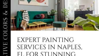
Blues and greens are nature-inspired colors that evoke calm, renewal, and serenity. They are ideal choices for bedrooms, bathrooms, and reading nooks—spaces where relaxation is the priority. A pale sky blue can mimic the calming expanse of the sky, while a muted sage green brings the refreshing feel of the outdoors inside. These colors can also help visually expand smaller rooms, making them feel more open and breathable.
Neutrals: Balance and Versatility
Neutral shades such as beige, taupe, gray, and off-white provide a versatile foundation. They create a timeless backdrop that works with any décor style, from modern minimalism to coastal chic. Neutrals also offer balance—allowing accent colors to pop while maintaining an overall sense of calm. For homeowners who want flexibility, neutrals are the perfect choice, since accessories, artwork, and textiles can easily update the room’s mood without a full repaint.
The Role of Accent Colors
While the main color palette sets the emotional tone, accents can fine-tune the atmosphere. Pops of color in furniture, artwork, or even trim can highlight certain areas of the home. For example, a soft neutral room accented with teal throw pillows may feel refreshing, while the same room accented with mustard yellow may feel cozy and welcoming. Accent colors also allow homeowners to experiment with trends without committing to a full color overhaul.
Case Study 1: Blue Walls Reducing Stress in Healthcare
A study published in Frontiers in Psychology found that hospital rooms painted in soft blues helped patients feel calmer and sleep better compared to stark, clinical white rooms. This supports what many homeowners already experience: blue tones can reduce stress and encourage restful sleep. Translating this into interior design, bedrooms and meditation spaces benefit significantly from soft, calming blues.
Case Study 2: Red Dining Rooms Encouraging Appetite
Research cited in the Appetite Journal shows that warm colors such as red and orange stimulate appetite and conversation, which is why restaurants often use them. Homeowners can adopt this strategy by introducing red accents—such as a terracotta feature wall, bold curtains, or even vibrant artwork—in dining rooms. These subtle touches encourage lively, engaging meals with family and friends without overpowering the space.
Case Study 3: Green Offices Boosting Productivity
According to a workplace study by the American Psychological Association, employees reported higher productivity and reduced mental fatigue in offices that incorporated green tones through paint, décor, or natural elements. In home design, a muted green office or study can promote focus and renewal, making it a smart choice for homeowners who work remotely or need a space for concentration and creativity.
Choosing the Right Colors for Your Home
While color psychology offers valuable insights, every home is unique. Natural light, room size, and personal preferences all play a role in how a color feels in practice. A shade that feels serene in a sunlit coastal home may feel cold in a shaded space. This is why consulting with a certified color expert ensures your palette not only looks great but also supports your lifestyle and emotional goals. At Creative Colors and Design, we specialize in tailoring palettes that transform ordinary spaces into personal sanctuaries.
If you’re ready to transform your home using the psychology of color, let Creative Colors and Design in Naples, Florida, guide you. Our certified color consulting and professional painting services ensure your home feels as good as it looks. Together, we can create a space that supports your lifestyle, enhances your mood, and reflects your personal style.