


23 Sep Embracing Warm Colors: The New Trend in Interior Design for 2025
As we move close to 2025, a fascinating shift in color trends is taking place. Homeowners are increasingly gravitating towards warm colors that evoke feelings of comfort and personal connection. This trend represents a departure from the cooler tones that have dominated interior design in recent years, offering a fresh perspective on how we can create our living spaces.
Sherwin-Williams‘s Director of Color Marketing, Sue Wadden, highlights this movement, stating that consumers are leaning towards “timeless colors, such as antiquarian browns and earthy yellows, that feel more personal and nurturing rather than predetermined color palettes.” She emphasizes the importance of personalization in our interiors, noting, “We’re all about creating spaces that are ours, and personalization may become the new ritual. The new self-care is that we really want to take care of our interiors like we’re taking care of ourselves and bring in meaningful things.”
This shift towards warmth signifies a deeper desire to transform our homes into personal sanctuaries. In the past, the concept of creating a sanctuary often relied on nature-inspired leafy greens and watery blues. However, we are now witnessing a subtle but impactful transition to warmer hues. From caramel browns to honeyed neutrals, these colors offer a different form of comfort that resonates deeply with our emotional needs.
Ruth Mottershead, the creative director of Little Greene, reinforces this sentiment by stating, “There is a greater need to surround ourselves with comforting, soothing colors that are not only easy to live with but provide warmth and serenity within our living environments.” This trend for warmer tones can seamlessly integrate into both contemporary and traditional homes, as well as bold or softer, pared-back design schemes.
At Creative Colors and Design, we understand the importance of choosing the right colors to reflect your personal style and enhance your living space. That’s why we offer professional color consultation sessions led by certified expert color consultant Vera Grech. Whether you’re looking to refresh your home with the latest warm hues or seeking a complete transformation, we are here to help you every step of the way.
We invite our readers to consider us for all your residential and commercial interior and exterior painting needs. With our expertise and dedication to quality, we can help you create a space that not only looks beautiful but also feels like home.
Ready to embrace the warm color trend in your home? Contact us today to book your color consultation with Vera Grech and discover how we can transform your space!”
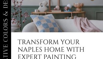
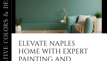
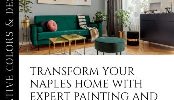
Our post’s featured image highlights some beautiful uses of these warm color pallets from the official Sherwin Williams social media post:
“The shades that accompany our September Color of the Month, Palm Leaf SW 7735, bring a contemporary edge to a collection of vintage-inspired colors. This modern interpolation transcends generations, giving way to the staying power of hand-selected style–especially when paired alongside complementary materials and finishes. Learn more: https://bit.ly/3ABpvCV![]() :
:
Palm Leaf SW 7735 (278-C7)
Pale Moss SW 9027 (143-C2)
Chinchilla SW 6011 (231-C5)
Oat Milk SW 9501
Antiquarian Brown SW 0045
Carnelian SW 7580 (276-C6)
Jogging Path SW 7638 (247-C2)
Cracked Pepper SW 9580
Featured materials:
SWG015026 (Urban Gold faux finish on MDF in a warm brown and a low sheen)
Resuflor Terrazzo TG
Factory-Applied Powder Coating, Custom Color
H&C Decorative Stains, color Verdant Plain
SWG016318 (Cottage Beige Burl in a close to the wood finish)
H&C Decorative Stains, color Wenge Wood
Resuflor Topfloor Metallic, color Bubbly
Factory Applied Liquid Coating, Custom Color
Resuflor Deco Quartz, color Cashmere
Resuflor Deco Flake 1/14”, color Pyrite
Superdeck Exterior Semi-Transparent Stain, color Leeward SW3533